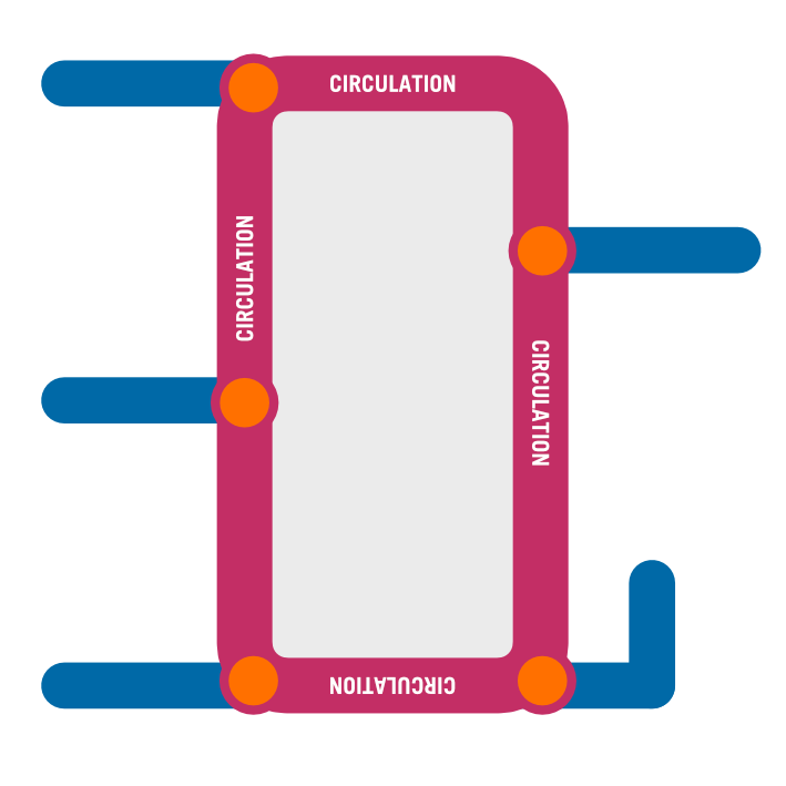
Wayfinding best practice basics. Lets start with the core purpose…
Read MoreOpen for everyone. Universal design is a declaration of respect for humanity…
Read MoreProven wayfinding frameworks. Check established models for those with the most value for your location…
Read MoreDistinctive features make memorable spaces. Make it easy to recognise by name…
Read MoreClear, concise, consistent. Resist the long list. Ensure everything has just one name…
Read MoreName consistency. The same language used across all touch points…
Read MoreComplex systems can be broken down into unfolding hierarchies of information…
Read MoreSimplify directions with groups and consistency…
Read MoreSetting the right size. Cap heights for distance and pace…
Read MoreUse the safe zone for everything critical…
Read MoreDesign for the viewing distance. Allow people to absorb information on approach…
Read MoreHeights and placement for visually impaired…
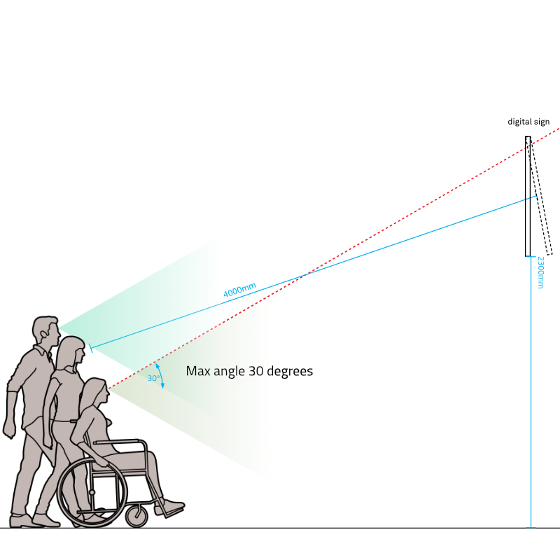
Read MoreElectronic signs – angles, placement and considerations…
Read MoreWalk the diagram. User test the scheme…
Read MoreExpectations specified down to the nuts and bolts…
Read MoreAn all clear for installation day…
Read MoreWatch how humans respond. Feed it back into the design…
Read MoreA commitment to style for continued system integrity…
Read More


