Signage and Wayfinding Design – Models
Proven wayfinding frameworks
Check established models for those with the most value for your location
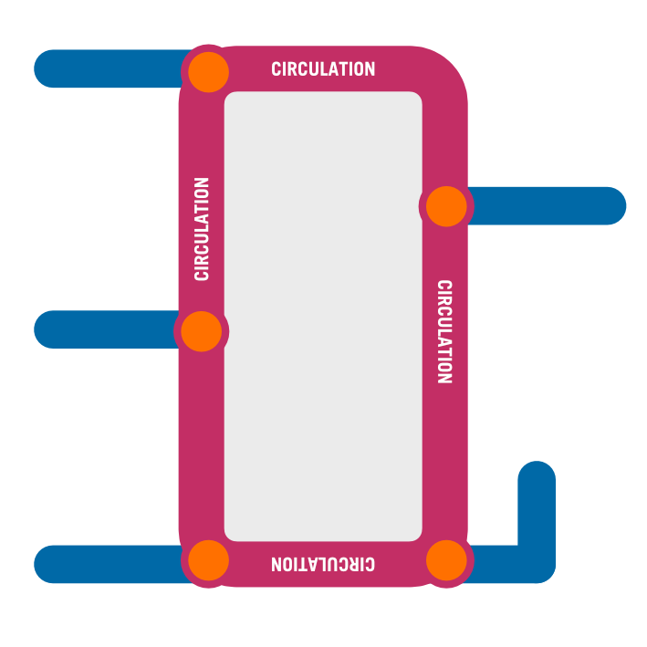
Circulation
Buildings designated by names or numbers. Like an airport where you start at a central terminal then proceed along a main arterial to multiple concourses to a gate.
Areas
Dividing the facility into zones/wings/or districts may be a natural fit to the location especially if names have been adopted. This concept can be extremely helpful in associating a “zone” to specific access points or entries.
There are dangers with this system. Inside it may be hard to discern transitioning from one zone to another. Terms like the “Tower 2” or “Stage 1” can be confusing.
Landmarks
Using identifiable built objects (such as lifts) as key reference points or anchors for navigation.
Streets
Using hallways like streets so corridors may have names and rooms along the corridor have addresses. Think hotels and apartment towers.
Compass
Compass orientation – from a central point where view lines can connect across distance to destinations. Usually smaller facilities indicating a clearly defined physical space like wings. Can be useful in open plan locations with a centralised arrival point.
For years north south east and west wings was sufficient, where this breaks down is if the facility expands or does not have “clean” north/south orientation. Some people do not orient well by compass especially inside.
information order
Destination information needs to be grouped and listed.
Groups can be by:
alphabet
function (such as all wards together)
direction
floor on directories
Within those groups the lists need an organising principle such as:
alphabetical (or numerical)
proximity – like highway signs, closest destination first.
traffic volume
primary destination first, then secondary, tertiary and amenities.


