Signage and Wayfinding Design – Information Design
Clear, concise, consistent.
Resist the long list and ensure
everything has just one name
Hierarchy
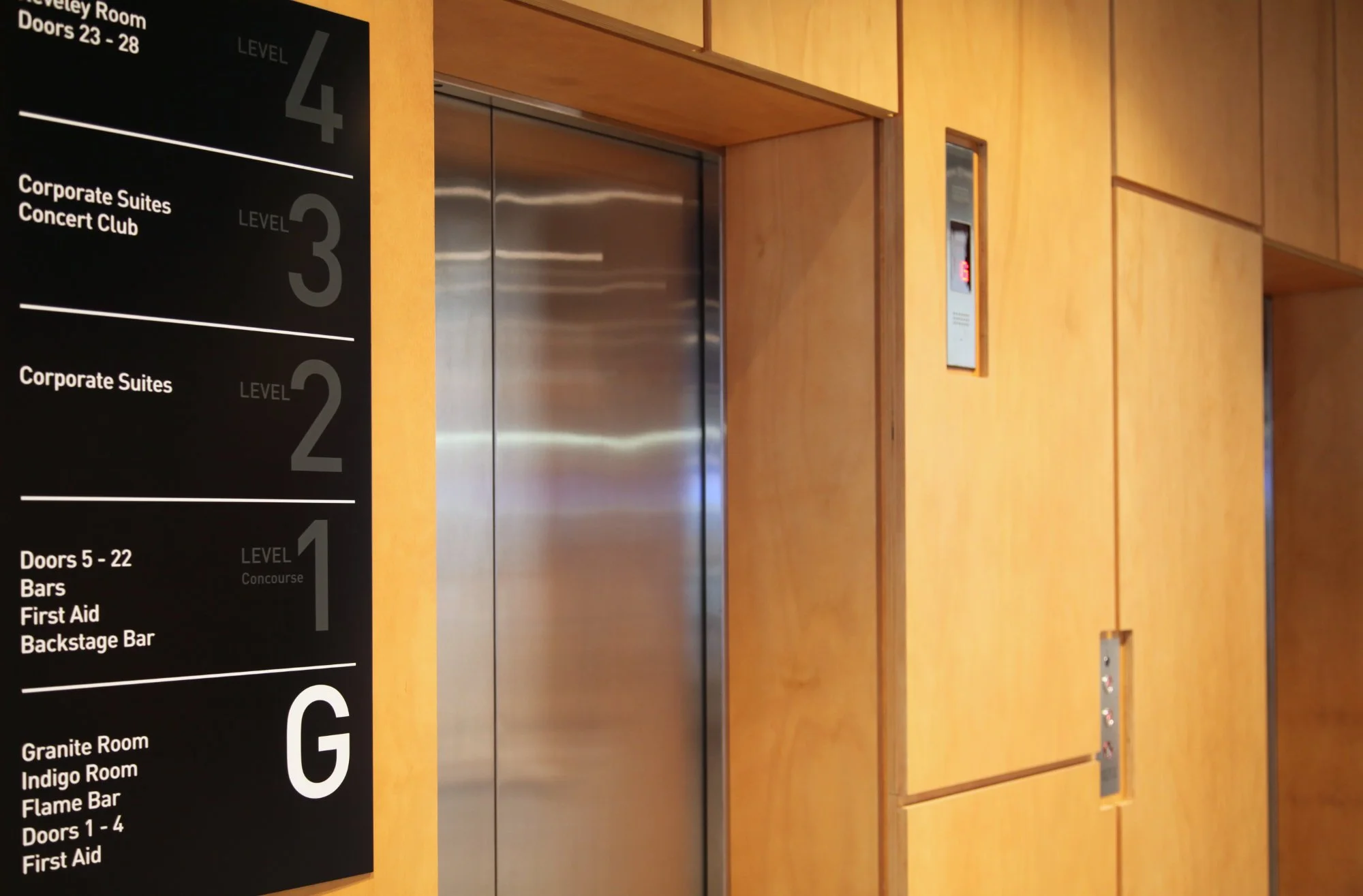
Directional signs should contain a maximum of five destinations. Key hub destinations should be listed at the top of the hierarchy or highlighted as primary information. Secondary destinations should be presented lower in the information hierarchy. Local amenities may appear at a third level. Destinations on signs should be grouped and ordered with a logic relevant to the destinations listed either;
by alphabetical order (for a longer list),
by the direction to the destination in clockwise order, or
by the order of distance to destination (closer destinations first).
Sequencing & logic
Cubicles or rooms should be numbered in a sequential order so that a visitor would arrive first at number 1 and next at number 2.
Branding
Once a visitor has entered the building, the relevance of the logo diminishes (the visitor now knows which building they are in), and generic wayfinding solutions should be applied without logo.
Curation
To keep signs relevant and specific information needs to be validated through a strict process to guard against clutter.
“Must know
Good to know
Nice to know”

