Wayfinding Design – Testing
Testing hospital wayfinding with in situ paper mock up
Lets see if the strategy and information design hold true
Before we layout signs
we check the content
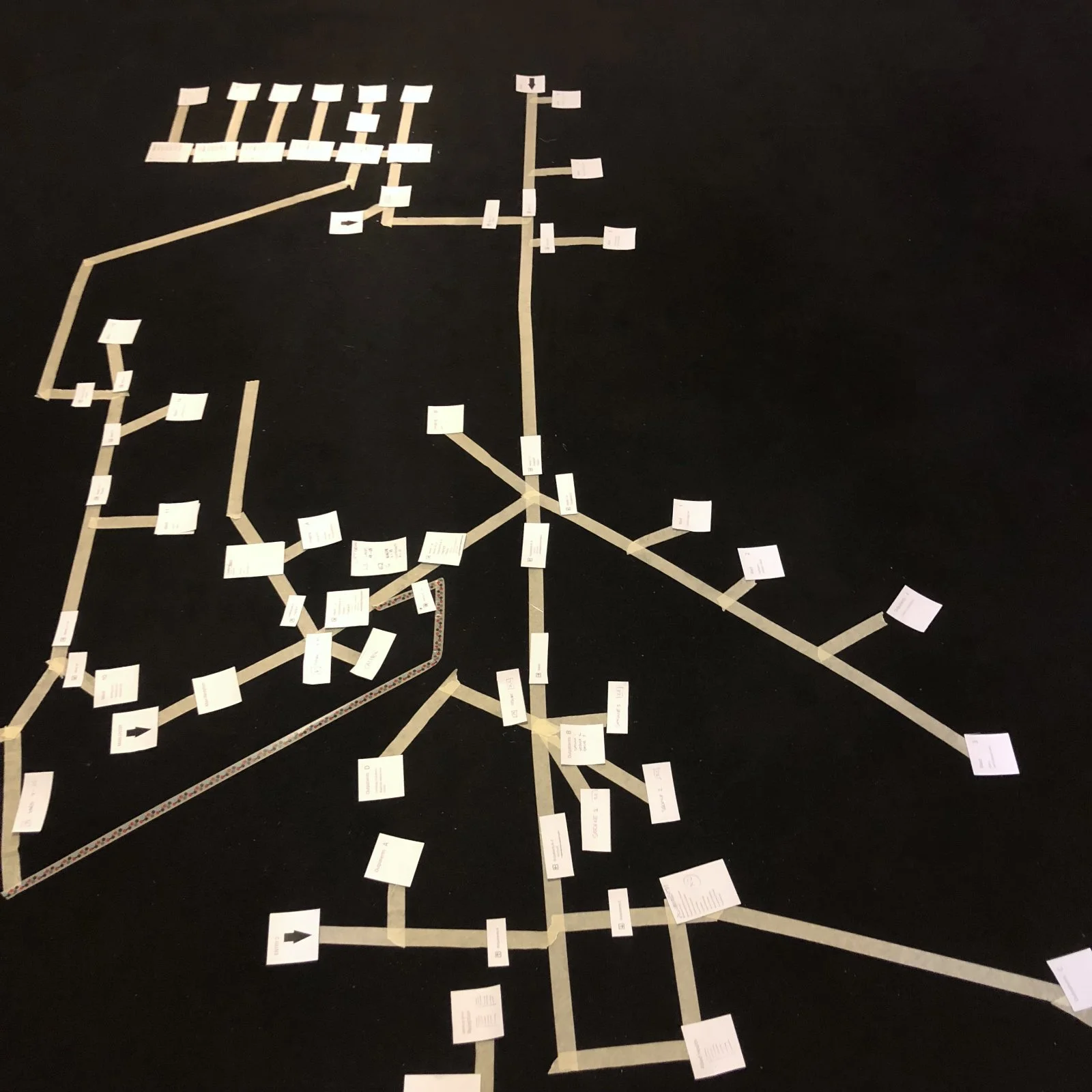
The Big Diagram
Simple and effective. We lay the scheme out as a walkable diagram with miniature mockups of the signs. Volunteers are tasked with specific objectives. A really solid way to gain valuable insight on the underlying concept and information methodology.
Many participants can be accommodated and options tested – inexpensively. This is our regular go to.
The big diagram. A walkable layout of the wayfinding sign program.
Paper Trials
Mock ups in situ allow for fine tuning of the design and trial in context for fit and visibility.
Behaviours and observation combine with direct feedback on location.
Testing hospital wayfinding with paper mock ups
VR Simulation
A walk. Through an electronic model.
Using virtual reality we provide the opportunity to experience how the environmental messaging works in its intended space. A way to test and proof wayfinding design options in context.
Design proving using VR provides a powerful set of tools for pre-installation evaluation. This allows all stakeholders to have certainty and confidence through an unparalleled understanding of the design.
Using 3D online models we can evaluate designs with large groups of individuals.


